


Vitamin Water Rebranding Project
Tracing back to the early essence of the brand

I feel excited writing this because I have been always interested in the intersection between business and design. I chose to study the Vitamin Water rebranding project conducted by Brain Collins, and the concepts truly impressed me.
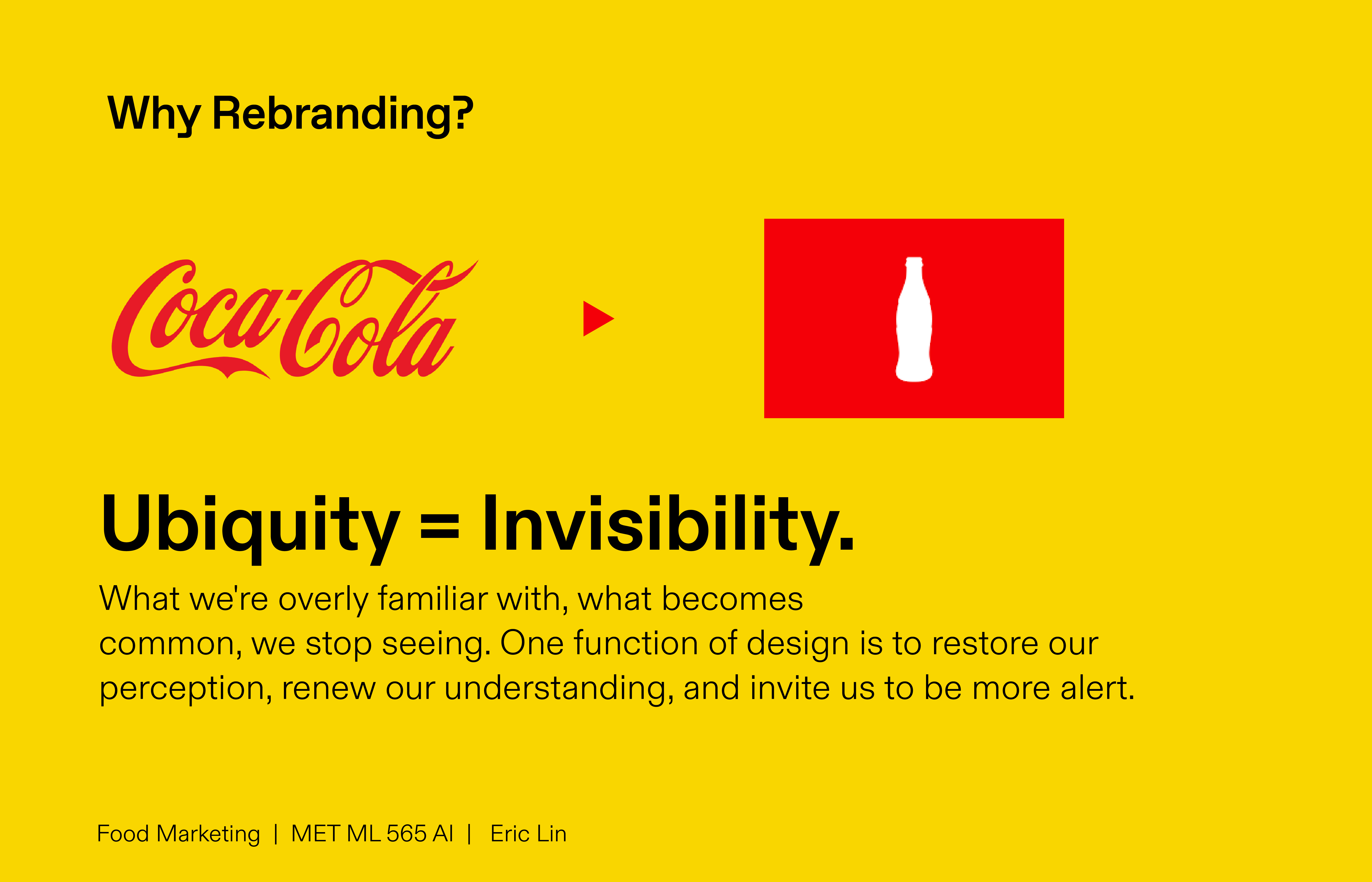
I watched several interviews with Collins where he discussed the process of marketing and branding. One key point that stood out was the reason why companies started rebranding. It's because people tend to become accustomed to what they see regularly, making them less aware of their surroundings. For instance, Coca-Cola's red ribbon becomes so familiar that it almost blends into the background and becomes invisible.
Brian Collins highlighted that when Vitamin Water first launched, people were captivated by its vibrant and vivid colors. The experience of encountering these colors in a deli or supermarket evoked a sense of joy, optimism, and vibrancy. The early essence of a brand often gets lost in the clutter of advertisements. In response, the agency designed a color palette that embraced simplicity while retaining the vibrancy. This versatile palette was intended for use across various aspects of branding, including packaging, vehicles, advertising, animations, and more.
Collins emphasized that the core idea behind every branding project is to revisit the brand's origins and rediscover what made it spectacular and resonate with people. This involves uncovering the essence that might have faded over time. For Vitamin Water, it's about the iconic shape and the vivid, optimistic, vibrant feeling that it gives to people. Therefore, Brian created a system that can work perfectly in advertising and marketing campaigns " The Iconic Bootle".

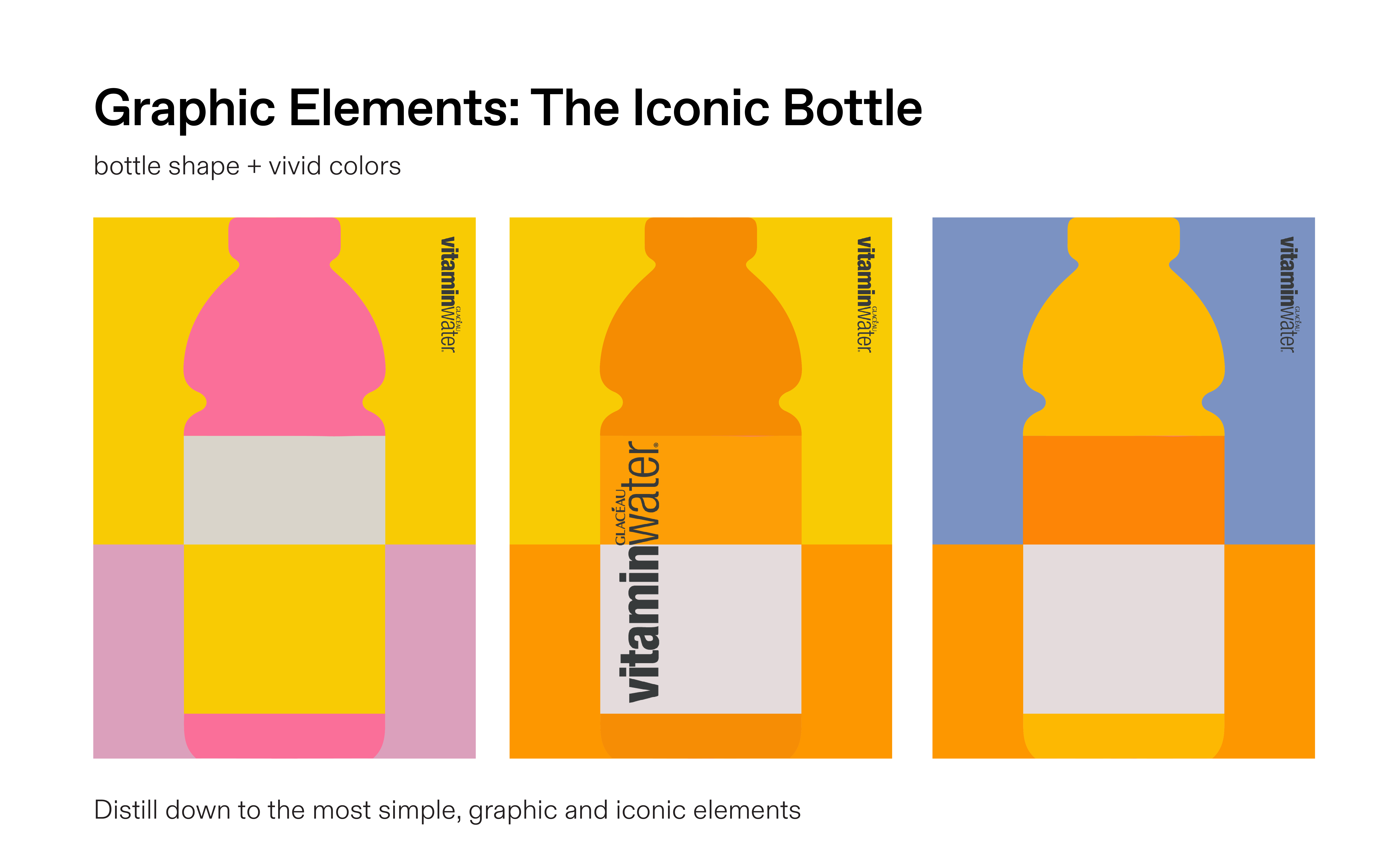
The early essence of a brand often gets lost in the clutter of me to product and advertisement diminishing its power over time. What Collins did was a straightforward yet powerful approach. He simplified and reduced all unnecessary information, effectively restoring our perception of the brand.